Emmü Fit
Brand Identity, UXUI
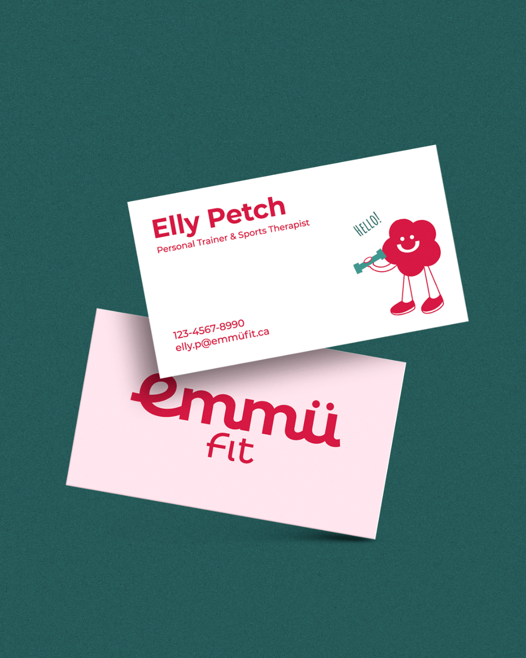
Client: Elly Petch
Roles:
Project Lead, Brand Designer,
UI Designer, UX Researcher
A wellness brand and app designed to be on women’s side at every stage of life.
Emmu Fit was created in response to the fitness industry’s lack of cycle-aware experiences for women. While many gyms, apps, and tutorials focus on performance, they often overlook women’s physiological and emotional changes across different life stages.
The project combines playful branding with an intuitive mobile app that supports movement, learning, and connection, creating a space where women feel understood, supported, and confident in caring for their bodies.


UX/UI
Design Approach
Workout × Period Tracking:
Personalized wellness care in one intuitive experience.
Many existing apps focus on either workout guidance or period tracking, rarely bringing the two together. Emmü Fit bridges this gap by integrating cycle-aware training with educational content and a community space, supporting both physical and emotional well-being.
Research also showed that many period tracking apps feel either overwhelming or overly simplified. In response, Emmü Fit focuses on a balanced structure where key features are accessible from the home screen, keeping the experience clear, intuitive, and free from pressure.
Sign Up & Questionnaire
Initial questions about the user’s cycle and lifestyle shape a personalized home experience.
Daily Check-In & Home
A check-in prompt appears at launch to support daily tracking. The home screen shifts with each cycle phase, updating content.
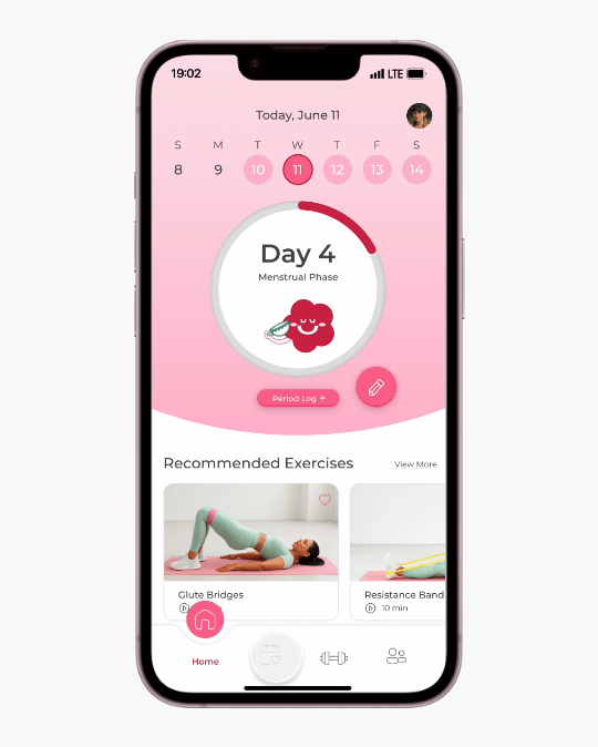
Core Features
From the home screen, users can easily access Workout, Community Chat, Calendar, and Settings.

BRANDING
Design Approach
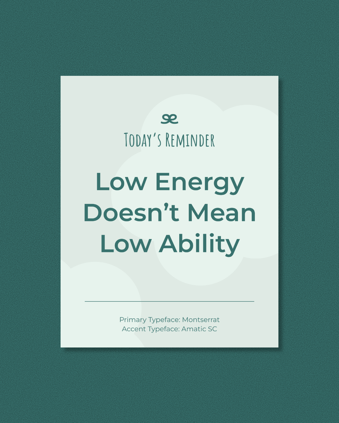
A playful and empowering brand designed to grow with women.
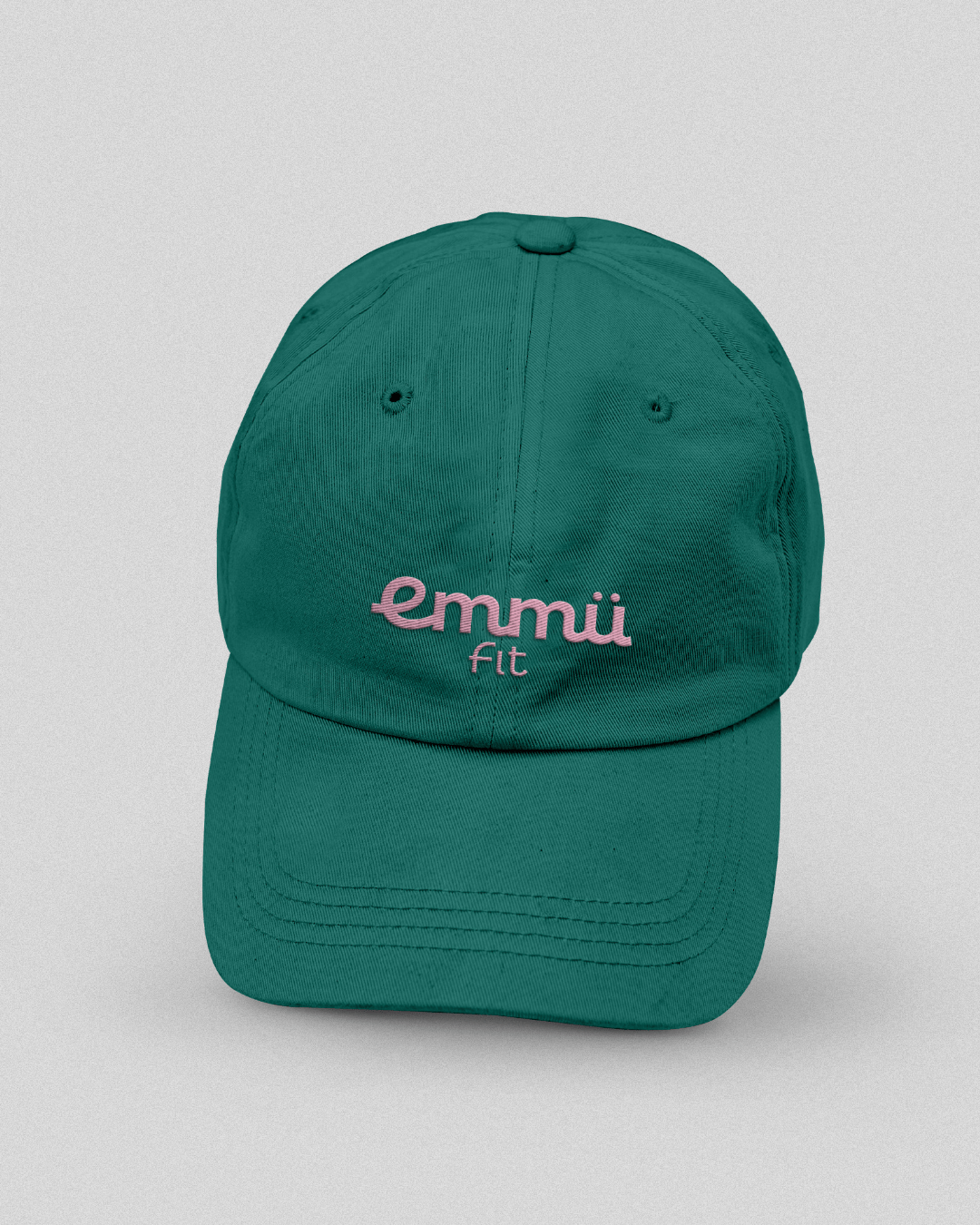
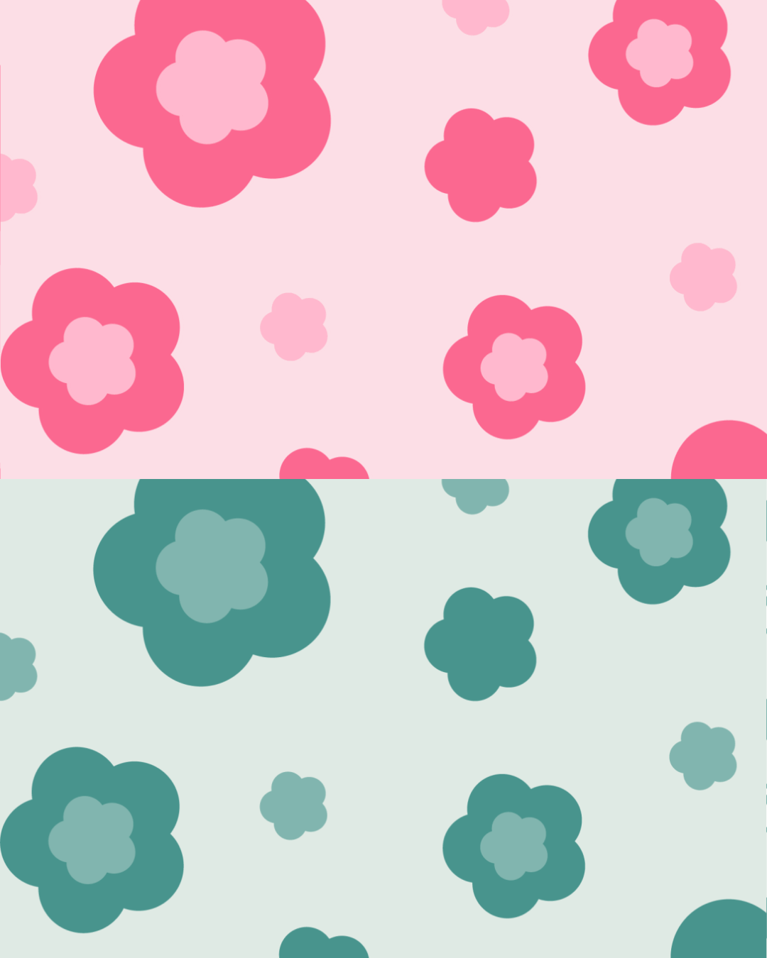
The client envisioned a playful, warm, and fun brand, using pink and red tones to empower and resonate with women. She also had plans for future merchandise and brand expansion, which influenced the need for a flexible visual system.
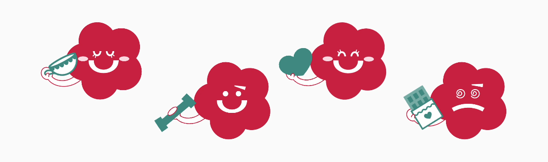
The identity balances friendliness and sportiness, creating an approachable yet energetic tone. A mascot was developed to strengthen personality and support the brand’s extension into physical products. To accommodate a wide age range of users, green was added to the color palette, broadening appeal while maintaining harmony within the identity.

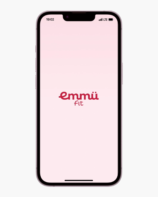
Flowing, connected letterforms symbolize movement and connection, reflecting Emmü’s vision of a supportive community, while bold typography reinforces its fitness focus. The wordmark pairs seamlessly with a playful mascot.